COSMIC COLLECTION: SPACE IN SHAPES


These are the artworks that are currently displayed in exhibition as

COSMIC COLLECTION: SPACE IN SHAPES.

Artworks 1 to 5 are as follows:
1. PILLARS OF CREATION; EAGLE NEBULA  2. BUBBLES NEBULAE  3. STARLET
4. JUPITER & CO.  5. GALAXIES GALORE #2  6. MILKY WAY GALAXY
7. SOLAR SYSTEM; MILKY WAY  8. HORSEHEAD NEBULA  9. EARTH RISING  10. PLUTO LOVES CHARON  11. ANDROMEDA GALAXY  12. SOLAR FLARE   13.SOLAR WIND  14. COSMIC CLUSTER 15. COSMIC BRIDGES 16. COSMIC STARFISH    17.  COSMIC CONNECTIONS  18. COSMIC CRECHE
19. SUPERNOVA  20. SUPERNOVA #2  21. PILLARS OF CREATION

Apologies for the weird layout of the pics, the lack of scale of the paintings and lack of text in places.  The very largest painting is GALAXIES GALORE#2, while STARLET is one of the smaller works and the COSMIC diamond-shaped trio are the smallest, with SUPERNOVA being the tiniest.  The rest are all fairly large works.

Apologies for the multiple Updates – I hope the layout comes through properly now – at least for Desktops.  What it does on mobiles is going to be pot-luck!  I had a lot of trouble loading and arranging these pics – they refused to be moved, deleted themselves or other pics, and finally refused to be named.  This program needs a lot of work to make it more user-friendly.

See my blog Shaped Canvases Open Images: SPACE IN SHAPES to see the theoretical concept underlying these Astonomical works.

Jud House   30/07/2017

* * * * *


Thoughts on PAINT APPLICATION TECHNIQUES

Adrift in Space 2
ADRIFT IN SPACE – Acrylic – Jud House

Further to my  https://judsartwork.wordpress.com/2016/11/03/the-rules-of-art/ and my https://judsartwork.wordpress.com/2016/09/04/notes-on-painting/ posts, I’ve been pondering the variety of painting application techniques as I’ve worked on my ‘space’ paintings for my coming exhibition.  It seems to me that there are no longer any rigid rules about what you use to apply your paint.  And I so approve of that.  It is not what you use to get there – it’s the completed artwork, its evocative image that’s important.

I paint in Acrylic, using synthetic brushes – they are the most compatible for the type of work I do.  They are sympathetic to the Acrylic.  They don’t interfere with the delicacy of some of the implied texture, and allow me to work into that so finely, pulling out images, teasing colour in between the texture.  But I use so much more to apply my paint.

ANDROMEDA GAALXY
ANDROMEDA GALAXY – Acrylic – Jud House

For the ‘space’ paintings, I’ve applied very dark background Acrylic paint into a smooth medium-density layer upon which to cast the stars, galaxies, nebulae and matter of the universe.  I’ve applied thin coloured layers of paint over this and lifted it off with various types of plastics (bags, wrappings, bubble-wrap) and toweling (paper, old tea towels, rags, washers) to show the space behind the implied texture above.  I’ve then used the lifted off paint on the plastics to apply it in dabs and smears to other dry works – waste not, want not.  I’ve painted the plastics with the paint, from neat to very wet and thin, and dabbed it on the works to build up colour and texture simultaneously.  I’ve used my fingers, either with unintentional paint that I’ve then applied, or intentionally dipping my finger tips into the paint to apply it in touches, dabs, smears and rubbing, to add to or modify or correct a part of the artwork.  On other artworks I’ve applied paint with skewers, knives, spoons, sponges, lids, and other miscellaneous objects that have come to hand.  Some artworks have all been brushwork, from the initial background brush to finer brushes to paint on thin layers as washes, to build up and moderate the colours used.

cropped-galaxies-galore-1.jpg

Cross-section of GALAXIE GALORE – Acrylic – Jud House

Apart from a few larger sized flat brushes for blending larger areas and laying background paint onto smaller works, I prefer synthetic Dagger brushes.  I’ve only found one brand that makes them, so far, but there must be others.  They are so versatile – like having the best of all the brushes rolled into one.  Turn them side-on and you can sweep layers (thin through to thick) of paint across the canvas, rolling slightly to create waves, twisting back and forth for unusual organic shapes, turning it on edge to create thin to thick lines, lifting it onto its tiny tip to draw a line as thin as hair.  They only seem to come in 4 smallish sizes but your can do a lot with the largest of them that you can do with any other medium brush.  I have other shaped synthetic brushes in jars, many tiny tip brushes that I used for the tiny line work although they tended to produced blobby little lines despite their minute size.  But since my discovery of the Dagger brushes they remain in their jars unused, like the jars of hogshair brushes that I’ve not used for years (except one recently to paint around the outside edge of a thin-framed canvas) and that felt a bit weird.

OLYMPUS DIGITAL CAMERA

REFLECTIONS – Acrylic – Jud House

Now for people who paint with Acrylic in thick, dense, structured brushwork, and who prefer the brushstrokes to show, and who build up ‘real’ texture that can be felt by touch, then hogshair (or synthetic) brushes are perfect for the tasks.  I’ve done many of these works in the past, but for the work I’m producing at the moment the hogshair brushes are not needed.  I may return to them at a future date – who knows – but I’m not discarding them or giving them away – they can sit in their jars till needed.

I know it’s a mundane and rather redundant thing to say, (and not aimed at experienced artists) but how you clean your brushes is so important.  Just a quick wash under the tap will not suffice.  Acrylic paint needs to be removed from the brush totally, or it will taint the next colour – unless you keep blue brushes for blue paint, red for red, etc  The paint tints the synthetic brush a little more than it does the hogshair, and embeds at the base of the ferrule a little less than the hogshair.  It needs to be massaged out.  I usually rinse my water container (a takeaway tub) then rinse the brush in that, emptying and refilling as it dirties, then finally massage the brush up near the ferrule to dislodge the last particles possible.  That way I don’t waste precious water, and end up with a clean brush.  Actually I usually do several brushes at once – whatever I’ve used for that artwork till the water needed changing.  The brushes last much longer and I don’t need to keep buying new ones.

NEBULAE
NEBULAE – Acrylic – Jud House

As you can see, I quite approve of the freedom of equipment, impliment, and utensil use that artists of today have at their disposal.  You are no longer considered to “paint like a child” if you get stuck into your artwork with your painted hands.  You’re allowed to mix utensils as well as media these days.  Go for it!

Jud House  6/01/2017

. . . . .

THE RULES OF ART.

The thing that I’ve realised after revisiting my art theory and history notes is that there are no longer any Rules of Art.  There are Techniques, Skills, Styles, Genres, and Subjective Perceptions of Art.

Image result for painting art
Feeling Free L2 – Peter Nottrott – Saatchi Art

Techniques:  are multiple, some recognised, others a mystery to the viewers and other yet-to-be-enlightened artists.  These are creations, experiments, accidental images discovered in and teased out of the initial foundation or background, intentional explorations with single or mixed media, and expressionism gone rampant.  Now I realise that this may not sound like Techniques – brushwork, carving, palette knife work, colour mixing, sculpting, impasto, washes, and so on – but they all involve and are extensions of these, resulting in some incredible artworks.

Skills:  are obviously still really valuable.  It is obvious that the degree of Art Skills applied in different works vary hugely.  Some appear not to be applied at all, yet behind every artwork is the intent of the artist.  What may appear to the viewer as just a single coloured canvas may be a deliberate exercise in colour intensity, or transparency, or variation of hue, brushwork, density, or the creation of optical afterimage on the retina of the prospective viewer.  Other artworks display every skill necessary to depict near photographic figurative work – sound drawing skills, chiaroscuro, tiny brushwork, perspective, volume, use of light, colour contrasts and complements, balanced composition, underlying structure etc.  Both are valid.  Both are Art as creations of the artists.

Image result for Christian Hook painting art
Sir Ian McKellan – Christian Hook

Styles:  are not quite the same thing as Genres.  I perceive Style as being the recognisable work of a specific artist, or group of artists – their signature.  Van Gogh’s work is recognisably his, as is Renoir’s, Matisse’s, Gauguin’s, and an interminable list of artists of all genres.  Today, thanks to the exposure via the Sky Arts Portrait Artist of the Year television program, the Styles of Christian Hook and Nick Lord, and also to a lesser degree that of the other contestants, are recognised instantly, world wide via social media.  The Style ‘Schools’ created within groups still show variations.  Collaborative works encompass the participants’ differences, producing a Style-Meld or Multi-Style. That is the astonishing thing about Art – that there can be so many Styles, such variety, a seemingly infinite degree of uniqueness that can be produced.  And what a gift that is to an artist – to develop, discover, create a unique Style!

Image result for Nick Lord painting art
Lance Sergeant Johnson Gideon Beharry VC – Nick Lord

Genres:  are the designations of the trends that occurred, and continue to occur, in the development of Art, and thanks to the Impressionists (a Genre) its freedom from rigid constraints in Techniques, Skills, Styles and Subject Matter.  The work can be Figurative, Impressionist, Cubist, Post-Impressionist, Expressionist, Modern, Post-Modern, DaDa, Surrealist, Digital Figurative and Fantasy, Art Wallpapers (computer screens) and so on to the undesignated, yet-to-be-labelled latest trends of dribbling, slashing, scratching, blurring, wiping, texturing, collaging, mixing and constructing that artists can dream up.  Do they need labels?  Is the Genre important any more?

Subjective perceptions of Art:  And so I come to this.  I have been surprised and dismayed to find how much the subjective perceptions  – their artistic preferences, their personal baggage – of those judging the various television art competition programs, inform their comments on the contestants’ artworks.  It is a competition, so there must be judgements, and of course the judges’ fields of expertise will affect their points of view.  But in this artistic era, where freedom of expression is not just encouraged but expected, the denigration of artwork that is pleasing to look at, that is pretty, or illustrative, is unacceptable.

Image result for illustrative painting art
Illustration – Double Exposure – Pat Perry 

Illustrative art is still Art.  It is a form of Figurative Art.  It’s place is not only in magazines or books  -it can hang on walls beside painterly works, or cubist works, or expressive works on an equal footing. The PUNCH magazine illustrations are still Art that hang proudly in galleries, and homes.  Paintings that are pretty, Watercolours of gorgeous light effects on colourful landscapes, are just as valid as a Portrait of a prominent person.  It feeds the emotions  of the viewer, producing happiness, a sense of serenity.  Art can be evocative, be about feelings.  In these days of stress, that is not a bad thing.  Art does not always have to carry a Message.  It doesn’t have to be about Issues.  Constable’s landscapes were about the landscapes, and the use of paint to capture the light and colours and shapes.

Artists, on the whole, are vulnerable people, exposing their work to the public hoping for understanding, comprehension, and validation, rather than negative criticism.  Consideration should be tantamount in the delivery of judgements – good points made followed by suggestions for tightening of skills needed for the specific style chosen by the contestant – as many judges do – rather than telling them it is dreadful , laughable, or lacking in skills – as a few judges do.  The ridiculing of contestants needs to stop.  It is unpleasant for all concerned, including the program viewers.  The audience want to see how the artists paint; how they can create their own versions of the designated subject matter.  They choose their favourites subjectively, and want to see them do well.  They do not want to watch people being humiliated and upset.  The shows should be about the Art and the Artists Styles.

Image result for digital painting landscape
Landscape Abstract Digital Painting – Simon Boxer

Do the Rules of Art still apply?  Or are Artists truly free to create,with acceptance and respect?

Jud House  4/11/2016

. . . . .

Notes on PRINT MAKING

Image result for Print Making
Self Portrait – Rembrandt – c1630

Print Making: is the process of transferring an original image from one surface to another repeatedly.  Prints are distinguished from paintings and drawings by having multiple originals, which are the products of creating multiples from one block or plate or stencil.  This is done by the artist’s own hands, or by those of an assistant, from a drawing, which is then signed and numbered when finished.

Image result for Print Making Durer
Four Horsemen of the Apocalypse – Durer

They are produced in Editions – the edges must show, by courtesy, and all notation done in pencil.  After the Edition is run the artist should destroy the original plate, block or stencil – but Second and Third Editions can be made if noted as such.  The First Editions are more valuable than the following ones.  This method can also be used for Cast Sculptures, where several of one piece are cast, then numbered accordingly – 1/4 is first of four cast.  Proofs can be taken during stages and labelled as such, then the artist makes appropriate adjustments.  There occur naturally, discrepancies from print to print which adds to their individuality.  (These are separate from photo reproductions of art prints, which can be signed by artists, numbered and sold.)

Image result for Print Making
Lino Cutting for Print Making

Intaglio: is the area of the print laying below the surface, created by etching and engraving.
Etching:  is done by acid biting into an exposed area on a copper, zinc, or aluminium plate, the resulting grooves of which are filled with ink.
Engraving:  is more spontaneous, scratching directly onto the plate which is softer – wood, copper, perspex, steel – then also filling the grooves with ink.  Damp paper is placed on the plate then rolled through a press.
Relief:  lino or wood cut – ink on the surface then printed.
Serigraph:  is screen printing onto paper or material, with different inks for each revealed layer.  The screen can be blocked with lacquer, paper; and printed with a squeegee or sponge.
Mono Prints:  has ink or paint manipulated by hand-held tools (brush, sponge) on the plate (metal, glass, perspex), then paper placed on top to print.  It’s possible to get two copies from one plate, but the second will be a lot lighter and less textured.
Lithograph or Planograph:  has the area to be printed on the same level as the non-printed area.  It’s the oil and water don’t mix principle, where grease is used to repel the ink.

Image result for Print Making
Printmaking on the Prairies – Cornerstone

Printing has linked with Craft, Graphic Art, and Commercial Art.  But it can be Fine Art, as its origins and evolutions go hand in hand with the discoveries in drawing and painting.  Since the earliest times man has been engraving on stones, antlers, and hides, for religion or ornamentation.  Egyptians etched contours on walls, pillars, obelisks, then coloured them in.  In the 15th Century, Durer included printing into  Fine Arts – he discovered the Renaissance theories in Italy and took them back home, did many engravings, etchings and woodcuts, and sold them.  It was a way of getting multiple prints to the general public.

William Blake, Goya, and Lautrec experimented with printing to show  the times as they were.  Blake coloured his prints, turning some prints into paintings.  Goya was a master print-maker, creating a series of engraved prints – of disasters of war, bull fights, man’s folly, and the dark side of man.  Because of their flat planes, and beautiful shapes, the Japanese print-makers has a strong influence on the Impressionist artists.

Image result for Print Making
Japanese woodblock print

Jud House  18/10/2016

. . . . .

Notes on GRAPHIC ART & GRAPHIC DESIGN

Image result for 20th century graphic art & design

History of Graphic Design Timeline – Austin Northcutt

Graphic Art: based on drawing as opposed to painting, is parallel to fine art.  it is more linear, and includes printmaking techniques.  Design is the orderly arrangement of shapes and the composition into a unified whole.

Graphic Design: (Commercial Art) is a discipline of this century – with chemical pigments, computers, cameras, movie cameras, photocopying, montage – the using of mechanical aids.  It is the use of art commercially, with a clear way of communication – ‘What you see is what you get!’ – with no doubt as to the message.  It is closely linked with advertising.

William Morris was the founder of Graphic Art, bringing function together with aesthetics.  Between the Wars, the Bauhaas School was formed, to bring art and industry together, to show the importance of functional design.  The students learned the skills of both art and industry, e.g. to give aesthetics to chairs.  In 1936, before WWII, it disbanded in Germany to go to the safety of Switzerland and the U.S.A.

Image result for 20th century graphic art & design william morris
Art and Craft of Printing – William Morris

Graphic Art is information conveyed without a doubt.  It is involved with 2D imagery, and includes film, posters, billboards, magazines, photos – in fact any still image on a 2D surface.  It is a 2D media.  Graphic Art is the visual media of advertising, highly dependent on the illustration or image and lettering or typography, e.g. a cartoon is Graphic Art, as graphic illustration is usually narrative.  Sometimes they need words as well as images to help put across the message.

16th Century book designers were the first real Graphic artists.  With the onset of literacy for the populace books were needed, and scribes produced these, not merely pages of words, but aesthetically pleasing pages.  The development of the printing press was a further jump – placing words on the pages with borders, taking care of the shapes of the letters.

The two major areas of Graphic Art are illustration and typography.

Image result for 20th century graphic art illustration

White Rabbit from Alice in Wonderland – illustrated by John Tenniel

Illustration: is not so much the technique, but the intentions – often linear, painted descriptively, and/or narratively.  It is when picture images are used for conveying specific information – Norman Rockwell illustrated the covers of the Saturday Post.  Methods used include painting, drawing, computer graphics, photos, or film, and can be kinetic – all to create art in the commercial sense.

Image result for 20th century  illustration norman rockwell   Image result for 20th century  illustration norman rockwell
Saturday Evening Post covers -Norman Rockwell 

It used to be used to illustrate the written word, e.g. Egyptian entombing pictures, Greek pictures of healing herbs.  Romans illustrated aquaducts and architecture with perfect perspective, yet their frescos and mosaics didn’t use it.  In the Middle Ages, prayer books (psalters) were illustrated with informative images.  Leonardo drew pictures (of helicopters) where no words were available.  Early illustration used woodblock prints (Durer), then on to etching and printmaking.  In the 17th Century the Japanese produced multi-coloured woodcuts, which were adapted by the French Impressionists in the 19th Century.

The 20th Century Graphic artists made use of cameras, films, videos, lithography, compasses, rulers, photocopiers, and computers to help with the clarity of the detail.  They also had the availability of chemically produced pigments such as Cobalt Blue and Cadmium Red.  Each page has a visual impact of its own, but is allied to the page beside it.

Image result for calligraphy oriental characters & egyptian hieroglyphs
Chinese Characters with Pictures

Lettering:  In the Dark Ages hand printing or copying was done by monks.  In the 20th Century, between the Wars, there was more awareness of typography, of the quality of the words and letters themselves – e.g. curvilinear letters and style for love letters, typed letters for complaints, scribbled letters for shopping lists.  The quality of the written letters imparts feelings.  The Japanese and Chinese created their characters of calligraphy to have a quality of visual as well as for meaning.  Oriental calligraphic idiograms are called Characters: Egyptians calligraphic idiograms are called Glyphs.  The visual aspect of letters imparts a content – varying widths, spacing, curvilinear or rectilinear are all taken into account.  The letters are seen as shapes to be used as an artistic element in the design.  The art element of letters is manipulated when words are created visually.

Image result for 20th century  graphic art lettering
NewModern Typeface Design – Sawdust

Jud House  17/10/2016

. . . . .

NEO-DADA & POP ART

NEO-DADA

Neo-Dada was considered a hybrid, as it brought painting and sculpture together – linking the art of Cubist collages with constructivism.  It was a freedom in visual arts, where the work could be both 2D and 3D – e.g. with the image painted, then a shelf pit in front of it, with sculpture inside – a combination of relief collages and assemblages, with subject matter being of every day things and experiences.  Neo-Dada was for the exploration of art, and its re-creation for the world.  Johns and Rauschenberg worked together, sharing a studio for a while, aware of the art all around them, and mixing it with the traditional.

Image result for jasper johns artist  Image result for jasper johns artist

Flag Complementary Colours – Johns – Corpse and Mirror II

Jaspar Johns:  painted a flag in green, orange and black, which when stared at gave an after-image of the red, blue and white flag.  He built up his works in encaustic (beeswax plus pigment) onto his canvases, instead of carving away, to give a texture and form to his work.  Assemblages, optical illusions, frottage, use of stencils, graphic art, fine art, crazy art, all brought together in his works.  He was often linked to Pop Art, as he was concerned with flat images, maps, flags, and numbers on paintings.  In the sixties, he included extraneous materials, e.g. knives, forks, stuck on, dangling off, as he attempted to create a new relationship between art and life – when does art end and life begin?  He produced sculptures, lithographs, sets and costumes for the ballet, working in 2D and 3D art.

Image result for robert rauschenberg artist
Charlene – Rauschenberg – 1954

Robert Rauschenberg:  also added objects to canvas, and called them combines – to blur the line between art and life.  He was also linked to Pop Art, drawing from daily life and media.  He used more ambiguous and painterly techniques, using paint medium more, and although he still had shock value in Dada, he had less silliness.  He brought to his works life’s unpredictable complexities, by ensuring that his works were hung in the right places to be seen properly – by motorising it, it needed to be near a power outlet, making it actually more complex.  He showed variations on Cubist collage, through Surrealism to Dada, and back again.

There has been a link drawn from Abstract Expressionism and Pop Art, through the works of Johns and Rauschenberg.  They both showed an interest in the treatment of the picture surface plane which is something that has been evolving from Manet, to Cubism to Abstraction.

POP ART (Popular Art)

Image result for warhol artist
Elvis Presley – print on canvas – Warhol

Pop Art is still with us in heart if not in art.  Johns and Rauschenberg lacked the commitment to the whole acceptance of the urban popular culture, unique to post WWII, that signified Pop Art.  Its manifestations were constantly changing, everything had to be new, promoting the idea of transience.  Although it originated in England, it grew in America due to the extra affluence of the latter.  Also this occurred because it was vulgar, transient, expendable, witty, sexy, gimmicky, and glamorous – all totally superficial, which the Americans loved.

It was in films, ready-mades, magazines, posters all used this form of art – painting, screen-printing, sculpture, assemblages, were all used to create this art that was in and out of fashion like clothes were.  It was often commercial – art made to sell to a vulgar society.  It reflected life in the fast lane, and current urban life.  It was very effective, it communicated, it was superficial, it was surface decoration.  The artists never attempted to justify it.  The good thing about it was that it returned to the image.  (Photo Realism and Romantic Realism also developed at this time).  it was not so much a movement as a tendency, with many artists appearing and disappearing.

Related image   Image result for andy warhol green coca cola bottles

Grevy’s Zabra – Warhol – Green Coca-Cola Bottles

Andy Warhol:  baffled critics and public alike by his success, whcih he made, along with his lifestyle, as art-form in itself.  he was his own work of art, he consciously personified Pop Art.  But he also had artistic talent – he could paint, draw, sculpt, and make screen-prints.  He employed helpers in factories, he made film and stage sets, he made personalities.  To be seen with him was to be IN.  His skill and influence on the art world stopped him being a con.  he sued startling colour and visual energy, was a graphic artist, and was genuine.  He had the ability of “turning the mediocre into the profitable”.  He was a manipulator of society, rock bands, gossip columns, gossip magazines, rumour, and urban cultural society in general.  He and his life-style was just a facade, and he was very powerful within his strata.  He was a product of his affluent time and took advantage of it.  He was pretentious.

Image result for lichtenstein artwork
Project 2 Vector Art – Lichtenstein

Roy Lichtenstein:  was more serious in his approach to art.  He began by painting great American historical events.  Then he worked comic book art and advertising art up into fine art – using tiny dots that comprised the photo image (as Seurat did with colour in Pointillism), and creating visual images with them on a larger scale.  Sometimes he took segments of a comic book image and blew them up so that his work was a design rather than a s comic image.  He used the qualities of design, the rhythms within design, and linear treatments, working with them and the concept of abstraction to communicate in an abstract manner.  The working of the painting and the subject matter were of very little importance – but the satire and public comment was.

Image result for oldenburg artwork
Man swimming on the banks of the Thames – Oldenburg

Claus Oldenburg:  had a great sense of humour.  His sculpture reflects it, creating surprise on the perceptions of the viewers by presenting the acceptable in an unacceptable way, e.g. furry cup and saucer.  He made the viewer contemplate smooth versus rough, hard versus soft.  He delighted in organic contours, creating not so much the art of the con rather than the art as fun.

Pop Art accepted and approved of all art, artifacts (even Tupperware, and comics).  Anything plastic was good.  If it were popular then it was valid –  Art could be made out of it. It explored the good and the bad of the fact and fantasy of life.

NB:  If you choose to quote from this blog please cite its URL in your Bibliography.

Jud House   12/10/2016

. . . . .

ABSTRACT EXPRESSIONISM – USA

From 1945 onwards the art scene shifted from Europe to America, as a result of the damage done during World War II, and the emigration of artists,some of whom took the Bauhaas school to Chicago.  They produced a new universal style, with great variety, of which the characteristics were hard to define, or label into schools or styles.  Artists evolved, with facets of art going in and out of style quickly.

Image result for abstract expressionism USA WWII artist
Transverse Line – Kandinsky

In New York, the art scene was trendy and nouveau riche – it was the thing to suggest that art was ‘new, radical and exciting’, or that it was ‘passe’.  Socially there was a constant changing of lifestyle due to returned soldiers – home loans, mortgages, college studies all being the influential thing to be or do.  There was very good and very bad art at the time, with many fashions – e.g. Op Art, Pop Art, Hard Edge Abstraction, Post-Painterly Abstraction, Hyperrealism, and Conceptual Art.  Cultural traditions and fine art coming to New York evolved into a plastic culture – Neo-Dada and Pop Art were inevitable artistic expression with a specific relationship to life.

Abstract Expressionism: was a direct descendant of all abstraction from Van Gogh, and including Surrealism (non-figurative), Dada, theories on Automatism and Chance developments – the development of creative intuition.  The centre of the Art World was wrenched away from Paris to New York, mainly because of money – art SOLD in America.  Suburbs were spreading creating a relationship between the suburbs and the city – people went to galleries to buy paintings to go in their new houses.  there were good jobs and good money.

It was art like Abstract Expressionism that was trendy, new and saleable, and therefore sought after.  The affluence of the New York society ensured it was important, with the economic boom seeing artists as viable investments.  Also sophisticates were looking for something exciting.  It was a time of pure materialism – with the development of the art manager.

Image result for pollock artistThe Key – Pollock

Abstract Expressionism can be broken into two avenues:
1. Action Painting – was usually non-representational, though not always.
2. Colourfield – was almost always non-representational.

ACTION

It was the first American art movement to dominate the world – energetic explosions on the canvas, with no recognisable subject except in De Kooning figures.  It was the action of the painting that was important, not the finished work.  The act of painting rather than the finished work, which the artist considered as dead, completed.  It developed from the improvisational drawings of Dada, with its automation and ambiguous space.  It incorporated Expressionism, Figurative and Non-Figurative Abstraction – influenced by the ideas of Kandinsky, Klee, and Miro.

Image result for pollock artist
Drip Painting – Pollock

Jackson Pollock:  created the idea of the overall composition in which he never intended to have a central focal image.  The creation of art was to extend beyond the canvas, and to create unity between the artist and his communication.  he lost himself in his art – he lived in it.  His thick application had a textural interest.  he moved around on the canvas which covered the floor, flicking paint, pouring paint, sitting amongst it, walking across it.  When he considered it finished he cut it up, stretched it onto frames and sold it.  He was influenced by Picassos, Surrealists, as well as a Mexican Realist, Orozco.

Image result for de kooning artist
Excavation – De Kooning

Willem De Kooning:   was a house painter and carpenter, who transferred draftsman lines into a painterly gesture.  He recorded the idea of creation and changes of mind by tracing the inspiration as it came.  He drew with his paint brush, with the mind changes visible.  He was influenced by Ongre (a Realist), Picasso, and Miro.  He preferred the female figure to painting still lifes, and always  tried to keep in touch with his image.  Despite this, he’s considered an action painter because of the recording of the changes of mind.  His works were characterised by bold brushwork and spontaneity.

COLOURFIELD

They are sometimes called Abstract Imagists, as they focus on a single image, which could be line of colour that they blow up to produce fields of colour.  These are devised to fill the field of the viewer’s vision.  They produced a broad overall design or simple colour on very large canvases.

Image result for clyfford still artist
PH-21 – Still

Clyfford Still:  was an art history teacher, who believed that artists should realise their own vision.  He gave a sense of rough energy, almost volcanic, with strong visual impact in thick pigment.  The contours appear eaten away creating a sense of power.  He developed from Surrealism to Colourfield, but was always an independent.

Image result for rothko artist
Colourfield Paintings – Rothko

Mark Rothko:  favoured a simple expression of a complex thought.  He simplified back to geometric areas of colour, particularly rectangles, often with them bleeding into each other.  It was a logical progressions from Mondrian.  He attempted with scale and use of colour to overcome and involve the spectator, so they would lose themselves in the work.  He played on the psychological effect of colour on the viewer.

NB: If you choose to quote from this blog please cite its URL in your Bibliography.

Jud House   11/10/2016

. . . . .

MODERN SCULPTURE

SCULPTURE INVITES TACTILE INTERACTION

Image result for henry moore sculptures
Family Group 1949 – Moore

Sculpture is a 3D object in space – the amount of space it displaces is its volume, the sense of solidity or bulk is its mass.  It should invite tactile examination, inspection, interaction.  The material chosen accordingly for its texture or feel – it is as important as its size, colour, imagery.  Its size gives it strong impact, due to its 3D nature.  Sculpture relates to life, more so than painting.  It is often made life-size, and occupies the 3rd Dimension as we do.  It can only relate to sculpture or art not to reality – not to what it represents, its structure (the muscle and flesh of the person or animal).

In the 20th Century  the sculptural elements were revolutionised – artists looked at materials, methods, and imagery, then changed them.  Mass and texture were changed by the modern materials now available – glass, plastic, perspex, sheet metal.  Even soft sculptures were created using padded or stuffed pantihose/tights turned into grandmas and grandpas sitting in rocking chairs.

Volume was changed by the use of the void, which allowed space to be sculpted, space defined by the solid contours of mass.  There was the development of the sculpting of the void, and the fact that the space created by the void altered the weight of the sculpture.

Image result for barbara hepworth sculptures
The Family of Man – Hepworth

The space occupied by a piece of sculpture, whether static, mechanized, motorized, affects the space it displaces – allowing the sculpture to interact with the air around it.  In modern sculpture the whole concept of energy, time, movement, and space becomes a part of the work as does it imagery, material, structure and method.

In the Middle Ages, sculptures were human, animal or organic imagery.  In the 20th Century, sculptures were just abstract shapes, with no narrative, no definition, no moral tale, no symbolism, no representational imagery.  They were just pleasing organic, geometric, or linear shapes.  Traditional materials in sculpture were clay (modelled), wood (carved), metal (cast), and stone (carved).  The modern sculptures used these, plus plastic, perspex, sheet metal, aluminium, nylon threads – materials that were soft or supple or both.  They mixed the media, which was a combination of the above.

Image result for henry moore sculptures
Vertebrae – Moore

They extended collage into assemblage in Cubism.  In the 20th Century they assembled by welding, gluing, nailing, screwing.  The greatest invention was the void – it gave a whole new element, which was used aesthetically rather than functionally – it defined work in new idiom.

Electrification was a new element or dimension – to make sounds, music, songs; they could move, whizz, buzz, pop – they could interact with their space, and constantly change their visual aspect, therefore stimulating the viewer to be active.  Concepts and theories of beauty changed – replaced by the 20th Century artists to reflect the quantum leaps by man in society during the turn of the century.

The Greeks and Romans saw beauty as apart from life, while the 20th Century artists saw beauty as involved with life.  Some of their works were figurative, some cast in bronze, some carved from stone.  But now artists had the choice to create the way they wished.  There were Formal investigations done in 20th Century Sculpture.

Image result for mademoiselle pogany Image result for mademoiselle pogany Image result for mademoiselle pogany
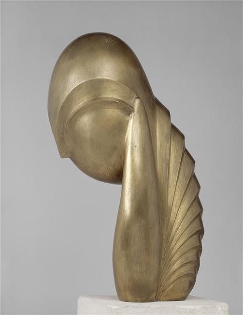
Mademoiselle Pogany – Brancusi

Constantine Brancusi: was a Romanian, with a unique understanding of materials.  He simplified his subjects by abstracting to the limits in order to give the essence of the subject by eliminating all distracting details.  He practised ‘truth to material’, as did Henry Moore and Barbara Hepworth – that is, what might look bad in wood, might look great in bronze.  Brancusi considered the oval as a natural form, and explored the use of the ovoid shape in his art, working through in series, often on one theme through different degrees of abstraction to the simple oval.  He progressed from Romantic naturalism to Abstraction, to elemental shapes.

Image result for barbara hepworth sculptures   Image result for barbara hepworth sculptures
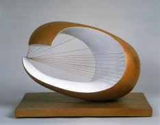
Pelagos 1946  – Hepworth – Wave 1943-44

Barbara Hepworth:  was a British carver, who with her complex ideas created a sculptural vocabulary.  She created works from the changing axis, swellings and varied sections of tree trunks to produce abstract forms of masses and planes – pure abstraction dictated by the essence of the material.  In PELAGOS (1946) she stretched musical instrument strings across a void to create tension within the work.  She was sensitive to the material’s qualities and allowed it to dictate the creation of the sculpture rather than force it to conform to a preconceived idea.  She investigated ‘absence’ in sculptures as much as ‘presence’, and believed that sculptures were of the landscape and needed to be outdoors in the landscape, the air, the clouds, to be seen at their best – not shut away in Museums.

Image result for henry moore nuclear energy  Image result for large torso arch  Image result for henry moore sculptures
Nuclear Energy;  Large Torso;  Large Standing Figure – Moore

Henry Moore: was a carver, with most of his works carved.  He also worked in ‘truth to material’ mode, and emerged as a major sculptor.  He evolved through Surrealism and Constructivism to create a highly personal style that blends power and humanism.  He used power and vitality – not just reproducing the image but showing the power and vitality of life.  He preferred the female figure as reclining nudes, and mother and child motifs, for fertility, using solid masses with voids to accentuate the volume and reveal its thickness and mass.  The voids let the viewer see through the sculpture, and view the landscape behind as part of the work.  This allowed the sculpture to interact with its surroundings.  When he worked in wood he made his shapes very biomorphic, following the grain and growth of the wood.  When he worked in stone he created more static works, while his works in metal and bronze he retained a sense of fluidity of the molten metal.

Image result for giacometti sculptures
Sculpture and Walking – Giacometti

Alberto Giacometti:  was a modeller, using elongated figures, and was concerned with movement and space.  He was a Surrealist sculptor and referred to the human anatomy and compact mass, but they had a transparent quality due to their elongation.  He used the human body as a symbol for inner emptiness of life, of mankind.  He used the inspiration of the deep level of the subconscious – reality beyond what we see, but within.  His works appear like ‘Icons in a mirage.’

Image result for lipchitz sculptures    Image result for lipchitz sculptures
Musical Instruments – Lipchitz – Cubism Figure

Jacques Lipchitz:  exploited the surface quality of bronze – he cast his works, and was a Cubist sculptor.  His works were aligned to 2D Cubist space and planes, but were in 3D, with no single point of view, but with Cubist multiple planes.  3D works of art are the sum of all their sides.  They have no specific point of view – no front or back.

If you choose to quote from this please cite its URL in your Bibliography.

Jud House    10/10/2016

. . . . .

FUTURISM

The Futurists were all concerned with movement in art – real or implied. The 20th Century was seen as highly mobile, socially, on every level – activity, noise, vibrations in life.  Manifestos were written 1909 and 1912 for Futurism, which closed in about 1920.  Futurism is strongly related to Cubism and Divisionalism, and to the use of the camera.

Image result for severini paintings
Blue Dancer – Severini – 1912

It started in Italy in the cities of Milan and Turin, which were highly individualised in the turn of the century.  There was an artistic revolt against the static nature of  art – hung on a wall, stood on a pedestal.  They wanted to replace that immobility with a reference to the movement and mechanism of their industrial cities.

They were very expressive, with an effort to be modern.  They wished to show the beauty of movement, of speed, the excitement in crowds, trains rolling and puffing steam, generating vibrations of movement and excitement.  They wished to show the beauty of  the labour of men, plus the pleasure of the sense of rebellion, and the joy about the various revolutions going on in Art.

Image result for giacomo balla art
The Cyclist – Natalia Goncharova – 1913

Futurism was an attempt to bring art to the machine age, trying to express artistically man’s movement through time and space, and the mechanics of the age.  They were influenced by Seurat and Divisionalism.  They saw the inter-relation and inter-reaction of planes of volume, of light and colour, of different view-points (the influence of Cubism), plus were influenced by the camera, the cinema, movies made by quickly flickering still photos.  They superimposed shapes one over the other – Duchamp’s NUDE DESCENDING A STAIRCASE (movement through time and space).

Gino Severini was strongly influenced by Cubist theories.  He created movement with the colour.  The Futurists emphasised lines of force to create a sense of after-image.  Giacomo Balla depicted speed itself – he was interested in the movement of the dog, rather than the image of the dog. Umberto Boccioni talked about modernism, but his works were based on traditional means.

Image result for giacomo balla art
Dynamism of a Dog on a Leash – Balla

They called themselves Futurists because they wanted to create art for the future – man’s transience in nature, importance of machinery in man’s life – to become more animated, more automotive.  Some of their subjects were: cars, trains, busy streets, bicycles, automobiles, a cascade of people.  Their titles usually included words like: speed, force, dynamism – to express the idea of movement itself.  Futurists influenced others in their era, with an ideal to represent movement in art.

OPTICAL ART – KINETIC ART – was that which really produced movement in art, particularly in sculpture (Calder’s mobiles).  It was art in motion, created with very modern materials: plastics, strobe-lights, machinery (whizz, pop, bang), and used sound and music.  Their purpose was to produce an unlimited variation of pattern, and to produce an active response from the spectator.  They definitely brought movement into art.  (Brancusi’s FISH was a motorised sculpture on a pedestal).

Image result for Calder art
The White Face – Calder – painted sheet metal, rod, wire.

Alexander Calder: an American, put his emphasis on mass, on movement in space, and airy light shapes. He created space, time and movement with his mobiles – Duchamp gave them the name, mobiles, Calder had called them Space-cages.  He was an engineer and a blacksmith, and introduced sculpture that actually moved, via air currents, hand-cranking, or electrification.  He was aware of welding techniques.

His shapes were often abstract, geometric, influenced by Miro, Arp, and Mondrian.  From Mondrian he got the primary colours, from Arp the use of organic shapes, and from Miro the use of the surreal and whimsical.  He used modern materials such as sheet metal, wire, and created special realms of fantasy and play, which we unique to humans.  His work was considered Kinetic – it really  moves (actual movement).

Image result for Calder art
Eagle (Seattle) – Calder

Optical Art appears to move – is implied or simulated movement, based on the perception of the viewer.  It gives the illusion of movement while the painting is actually static.  Op Art continued the research of the Impressionists into light and colour.  It leaves the world of nature to go into non-representational imagery.  It is based on the unique manipulation of perspective and colour relationships.  They wanted to explore the possibility of human perception, of looking at the psychological response to colour (Seurat and Kandinsky), and reactions to linear configurations (Seurat and Mondrian).  They wanted to extend the visual sensations of sight and how we see things move.  Op Art is Formal rather than expressive.

Image result for Calder art    Image result for Calder art
Painting – Calder – Screenprint

Victor Vasarely:  was Hungarian, who activates the paintingg surface by meticulous manipulation of colour and shape in a Formal and technically expert way.  He used geometric shapes, tonal balance, contrastinb colours, creating ambiguous directions in his work.  He was considered the originator of OP ART.  He created the illusions of tensions – animated stillness.

  Image result for vasarely artwork    Image result for vasarely artwork
OP ART – Vasarely – Sign sculpture (Hungary)

Jacob (Yaakov) Agam:   developed art which the spectator had to move around, to shift their viewpoints, to create a continual change (virtual movement by viewer).

Bridget Riley:  was British and the sensation of the 60’s.  She analysed Pointillism, bent-line perspective, positive force, violent turbulence, and the illusions created by these.  She worked out the designs on small pieces of paper, then when it worked she transferred the design onto the large canvas, and her assistants painted it with her carefully mixed colours.

Image result for agam artwork   Image result for bridget riley artwork
Dizengoff Square Fountain – Agam;  Bridget Riley in front of her work 1968

NB: If you choose to quote from this blog please cite its URL in your Bibliography.

Jud House   6/10/2016

. . . . .

CUBISM

Cubist art approached visual reality from a revolutionary track, defying the accepted norms of society of how works should be presented.  There were five revolutionary ways in which Cubism was presented.

Image result for picasso art   Image result for braque cubism paintings
Mediterranean Landscape – Picasso;     Musical Instruments – Braque

  1.  It sought a new pictorial experience – not repeating constant flux of artistic tradition but relying on personal reconstructions of what the artist thought was real – not based on tradition, but on insights and instincts.
  2. It dissected the volume of its subjects – its volumetric form.
  3. It simplified pictorial space – with no perspective or space – no illusion to spacial depth, with the flatness of the picture plane.
  4. It approached, examined and experimented with construction of 3D images on 2D picture planes.
  5. It discovered the essence of reality of volume in space and represented it without distortion – Simultaneity.

The Cubists tried to rewrite the rule, in particular the old problem of a 3D image on a 2D picture plane.  The Egyptians had solved the problem of depicting the whole of the subject by showing the eyes front on in a profile. They maintained the flatness of the picture plane surface while implying volume within the subject matter.

Image result for braque cubism portraits paintings     Image result for picasso cubism paintings
Portait de Femme – Braque;     Picasso – Woman Blue Hat

Pablo Picasso and George Braque based their works on Cezanne’s ideas, deciding to convert the cubic volume into planes to create a whole new pictorial reality.  Cubism rejected the emotional way of representation – they wanted to reconstruct as a formal style of art, which could be expressive as well.  they worked side by side pushing the ideas along – analysing the picture plane and turning the volume into planes.  Picasso and Braque were the co-originators of Cubism, although there were no theories or manifestos written about it until this was done late by critics.

There were other developments during the developement of Cubism – Xrays, microscopes, aircrafts, Freud, etc.  These changes were reflected in art.  There were no specific rules, but many styles of Cubism – Formal, Expressive, Interpretive.  Cubism liberated the artists completely, from medium, form, content, and subject, e.g. sculpture of BULL’S HEAD.

Image result for braque cubism sculpture   Image result for picasso cubist sculpture bull's head

Head of a Woman (First Cubist Sculpture) – Picasso – Bull’s Head

The Cubists made constructive sculpture of odd materials.  Shapes also were no longer completely descriptive – not the underlying shapes – they could be avoided if the artist chose.  They didn’t have to use symbolic meanings.  The content was altered, with no need for  a message, e.g. happy or sad.  Also with the subject matter – there was no need to paint things as they were.  This released artists from the need to imitate nature, while their art still related to life and nature.

Cubism was one of the greatest revolutionary contributions in artistic space since the 15th Century.  The concept of looking into the canvas was changed to looking onto the canvas – it broke the ‘window of the world’ – giving no spacial depth while suggesting volume and depth in a different way.  They used the idea of ambiguous space by overlapping, with colours advancing and receding, and of an arbitrary nature.

Image result for Cubism    Image result for Cubism
Man on a Balcony – Albert Gliezes 1912; Portrait of Picasso – Gris 1912

PHASES OF CUBISM
1.  Proto-Cubism – Cezanneism  1907 – 1910
2.  Analytical Cubism –  1910 – 1912
3.  Synthetic Cubism –  1912 – 1914

  1. Proto-Cubism:  Depth through slabs of colour, using planes – addressed volume as planes – each plane had a value – could create ambiguous spacial references – cool colour planes receded, warm colour planes advanced.  Each composition had various value planes.  It freed images from representational state – used transparent overlappings, threw away some of the planes, and emphasized patterns.
  2. Analytical Cubism:   was overlapping of transparent colours, removing colours, discarding concern for the subject matter – pattern-making with emphasis on ambiguous space.  Pictures became monochromatic to create whole new visual – they reshuffled the planes.
  3. Synthetic Cubism:  They recomposed planes of volume into whole new picture images.  They made collages, geometric shapes that became organic images.  They used mixed media which involved building depth up on the canvas, with the interest in its visual image rather than its subject matter.  It had no relationship to reality, but to ideas.

Pablo Picasso      Individual characteristics.
George Braque    Revolutionary characteristics.
Juan Gris             Pictorial analytical style.
Fernand Leger
(Robert Delauney)

Image result for picasso cubism paintings
Guernica – Picasso

Pablo Picasso realised what Cezanne was doing, and understood the theories he wrote about, and followed them through in a revolutionary way.  He searched for different ways to arrange the elements of the subject on the picture plane.  He was faithful to what he was doing – was   a leader, an innovator.  He was more than a Cubist painter – he did lithographs, sculpture, drawings, constructions – moving from on to the other freely, intuitively, working on them simultaneously at times.

Image result for braque analytical cubism paintings
The Musician’s Table – Braque 1913

George Braque worked in tandem with Picasso.  His work was Fauvish initially, he created subtle relationships in his paintings, colour to pattern to texture.  He worked in the synthetic stage, reconstructive work in a lyrical style.  He showed the ideology of respect for the surface of the painting, reflected good design sense, and a flattening of space.  He used simultaneity, harmonious colours, motif making.  He developed Cubism to a high degree. He also worked in stained glass, art designed jewellery, and lithographs.

Image result for juan gris cubism paintings
Clock and Bottle – Gris

Juan Gris was usually colourful, aimed to create objects not found in nature, composed with abstractions – started with colours suggesting the subject to him.  He worked with abstractions of colour and shapes – collages.  He advanced on to Synthetic Cubism (intuitive creativity) then on to Surrealism.

Image result for leger cubism paintings
Soldiers Playing Cards – Leger

Fernand Leger had machine precision evident in his work, and also factories.  He produced art that celebrated modern urban life, with which he showed dissatisfaction later, with his figures becoming robot-like, de-humanised.  He experimented with film, designed sets, did series paintings (builders, constructions, bicycle riders, machinery), mosaics, murals, stained glass, ceramic structures, and he extended 2D art into different media.  He created stability and movement together by interlocking planes of volume together.  He disassociated colours to shapes and outlines.  His works were puzzle-like – disassociating on element of art from another.

Image result for Delaunay works of orphism   Image result for Delaunay works of orphism
Simultaneous Windows on the City 1912 – Delauney – Orphism

Robert Delauney was lyrical, vital, sensual with his use of colour, with an interest in the music/colour relationship like Kandinsky.  He eliminated the reference to subject, to volume, bringing in light and rhythm by use of colour.  Along with Kandinsky, he was a pioneer of Non-Figurative art. With his wife Sonia, he co-founded the ORPHISM art movement, with colour forces, and abstractions with rhythmic circles and discs, thus breaking the rigidity of Cubism.

NB: I you choose to quote from this blog please cite its URL in your Bibliography.

(C) Jud House  18/09/2016

. . . . .