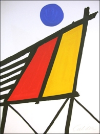
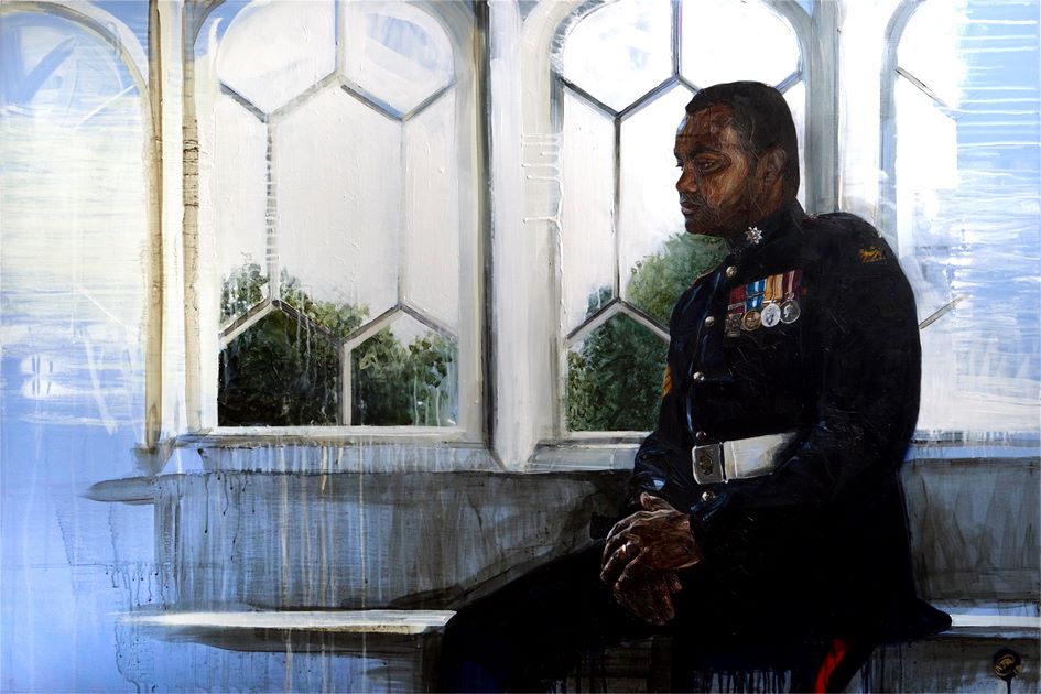
NEO-DADA
Neo-Dada was considered a hybrid, as it brought painting and sculpture together – linking the art of Cubist collages with constructivism. It was a freedom in visual arts, where the work could be both 2D and 3D – e.g. with the image painted, then a shelf pit in front of it, with sculpture inside – a combination of relief collages and assemblages, with subject matter being of every day things and experiences. Neo-Dada was for the exploration of art, and its re-creation for the world. Johns and Rauschenberg worked together, sharing a studio for a while, aware of the art all around them, and mixing it with the traditional.
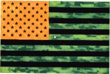

Flag Complementary Colours – Johns – Corpse and Mirror II
Jaspar Johns: painted a flag in green, orange and black, which when stared at gave an after-image of the red, blue and white flag. He built up his works in encaustic (beeswax plus pigment) onto his canvases, instead of carving away, to give a texture and form to his work. Assemblages, optical illusions, frottage, use of stencils, graphic art, fine art, crazy art, all brought together in his works. He was often linked to Pop Art, as he was concerned with flat images, maps, flags, and numbers on paintings. In the sixties, he included extraneous materials, e.g. knives, forks, stuck on, dangling off, as he attempted to create a new relationship between art and life – when does art end and life begin? He produced sculptures, lithographs, sets and costumes for the ballet, working in 2D and 3D art.

Charlene – Rauschenberg – 1954
Robert Rauschenberg: also added objects to canvas, and called them combines – to blur the line between art and life. He was also linked to Pop Art, drawing from daily life and media. He used more ambiguous and painterly techniques, using paint medium more, and although he still had shock value in Dada, he had less silliness. He brought to his works life’s unpredictable complexities, by ensuring that his works were hung in the right places to be seen properly – by motorising it, it needed to be near a power outlet, making it actually more complex. He showed variations on Cubist collage, through Surrealism to Dada, and back again.
There has been a link drawn from Abstract Expressionism and Pop Art, through the works of Johns and Rauschenberg. They both showed an interest in the treatment of the picture surface plane which is something that has been evolving from Manet, to Cubism to Abstraction.
POP ART (Popular Art)

Elvis Presley – print on canvas – Warhol
Pop Art is still with us in heart if not in art. Johns and Rauschenberg lacked the commitment to the whole acceptance of the urban popular culture, unique to post WWII, that signified Pop Art. Its manifestations were constantly changing, everything had to be new, promoting the idea of transience. Although it originated in England, it grew in America due to the extra affluence of the latter. Also this occurred because it was vulgar, transient, expendable, witty, sexy, gimmicky, and glamorous – all totally superficial, which the Americans loved.
It was in films, ready-mades, magazines, posters all used this form of art – painting, screen-printing, sculpture, assemblages, were all used to create this art that was in and out of fashion like clothes were. It was often commercial – art made to sell to a vulgar society. It reflected life in the fast lane, and current urban life. It was very effective, it communicated, it was superficial, it was surface decoration. The artists never attempted to justify it. The good thing about it was that it returned to the image. (Photo Realism and Romantic Realism also developed at this time). it was not so much a movement as a tendency, with many artists appearing and disappearing.
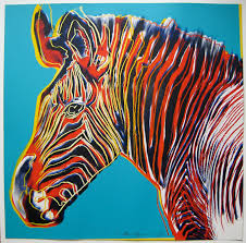

Grevy’s Zabra – Warhol – Green Coca-Cola Bottles
Andy Warhol: baffled critics and public alike by his success, whcih he made, along with his lifestyle, as art-form in itself. he was his own work of art, he consciously personified Pop Art. But he also had artistic talent – he could paint, draw, sculpt, and make screen-prints. He employed helpers in factories, he made film and stage sets, he made personalities. To be seen with him was to be IN. His skill and influence on the art world stopped him being a con. he sued startling colour and visual energy, was a graphic artist, and was genuine. He had the ability of “turning the mediocre into the profitable”. He was a manipulator of society, rock bands, gossip columns, gossip magazines, rumour, and urban cultural society in general. He and his life-style was just a facade, and he was very powerful within his strata. He was a product of his affluent time and took advantage of it. He was pretentious.

Project 2 Vector Art – Lichtenstein
Roy Lichtenstein: was more serious in his approach to art. He began by painting great American historical events. Then he worked comic book art and advertising art up into fine art – using tiny dots that comprised the photo image (as Seurat did with colour in Pointillism), and creating visual images with them on a larger scale. Sometimes he took segments of a comic book image and blew them up so that his work was a design rather than a s comic image. He used the qualities of design, the rhythms within design, and linear treatments, working with them and the concept of abstraction to communicate in an abstract manner. The working of the painting and the subject matter were of very little importance – but the satire and public comment was.

Man swimming on the banks of the Thames – Oldenburg
Claus Oldenburg: had a great sense of humour. His sculpture reflects it, creating surprise on the perceptions of the viewers by presenting the acceptable in an unacceptable way, e.g. furry cup and saucer. He made the viewer contemplate smooth versus rough, hard versus soft. He delighted in organic contours, creating not so much the art of the con rather than the art as fun.
Pop Art accepted and approved of all art, artifacts (even Tupperware, and comics). Anything plastic was good. If it were popular then it was valid – Art could be made out of it. It explored the good and the bad of the fact and fantasy of life.
NB: If you choose to quote from this blog please cite its URL in your Bibliography.
Jud House 12/10/2016
. . . . .


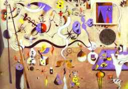
 The Key – Pollock


,_Albright-Knox_Art_Gallery.jpg)